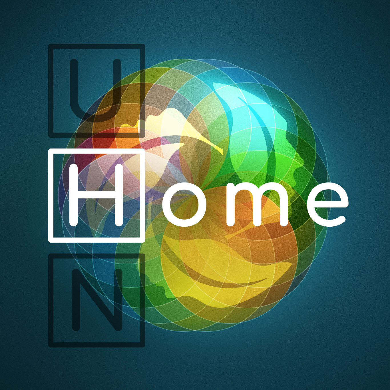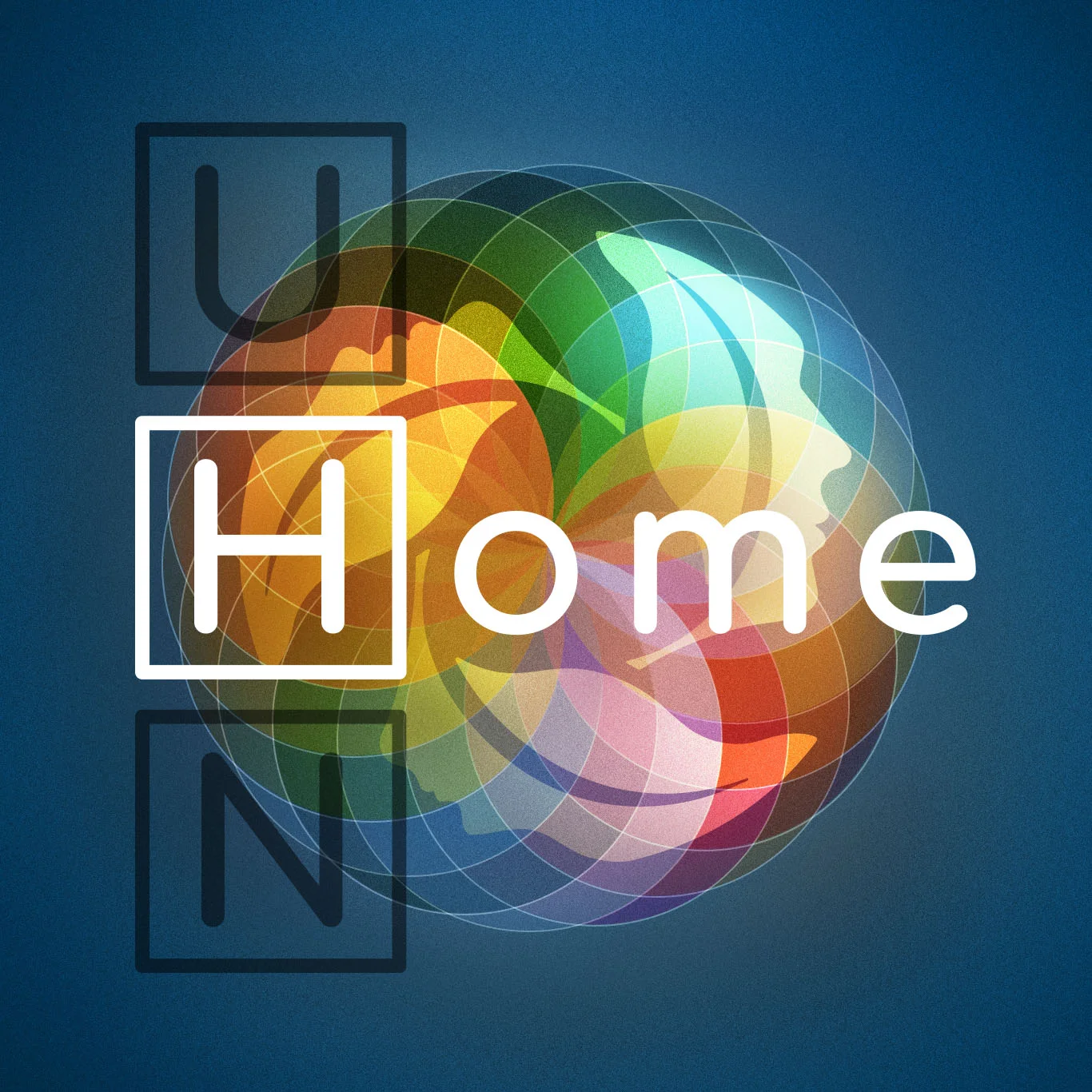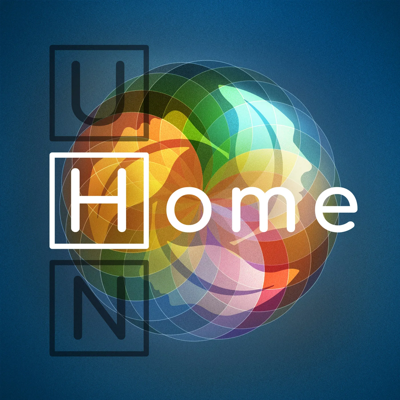
UHN Home Podcast
To celebrate the 150th anniversary of Canada’s confederation, the University Health Network – the largest healthcare research organization in North America – commissioned a podcast to celebrate the diversity of their employees who have come from around the world and work at UHN, and stories about employees whose families have called Canada home for more than 150 years.
The client wanted the logo to show that one’s coming HOME to the University Health Network, and so the arrangement of the word HOME combined with the acronym of UHN is reflective of the world-renowned research and advancements in healthcare the organization is involved in. We explored different colour schemes and background treatments, stylizing the letter H similar to the [H] hospital symbol, and created several mockups to arrive to a mutual concept that is subtle but speaks of diversity, not specific of healthcare or any imagery that is too specific in scope.









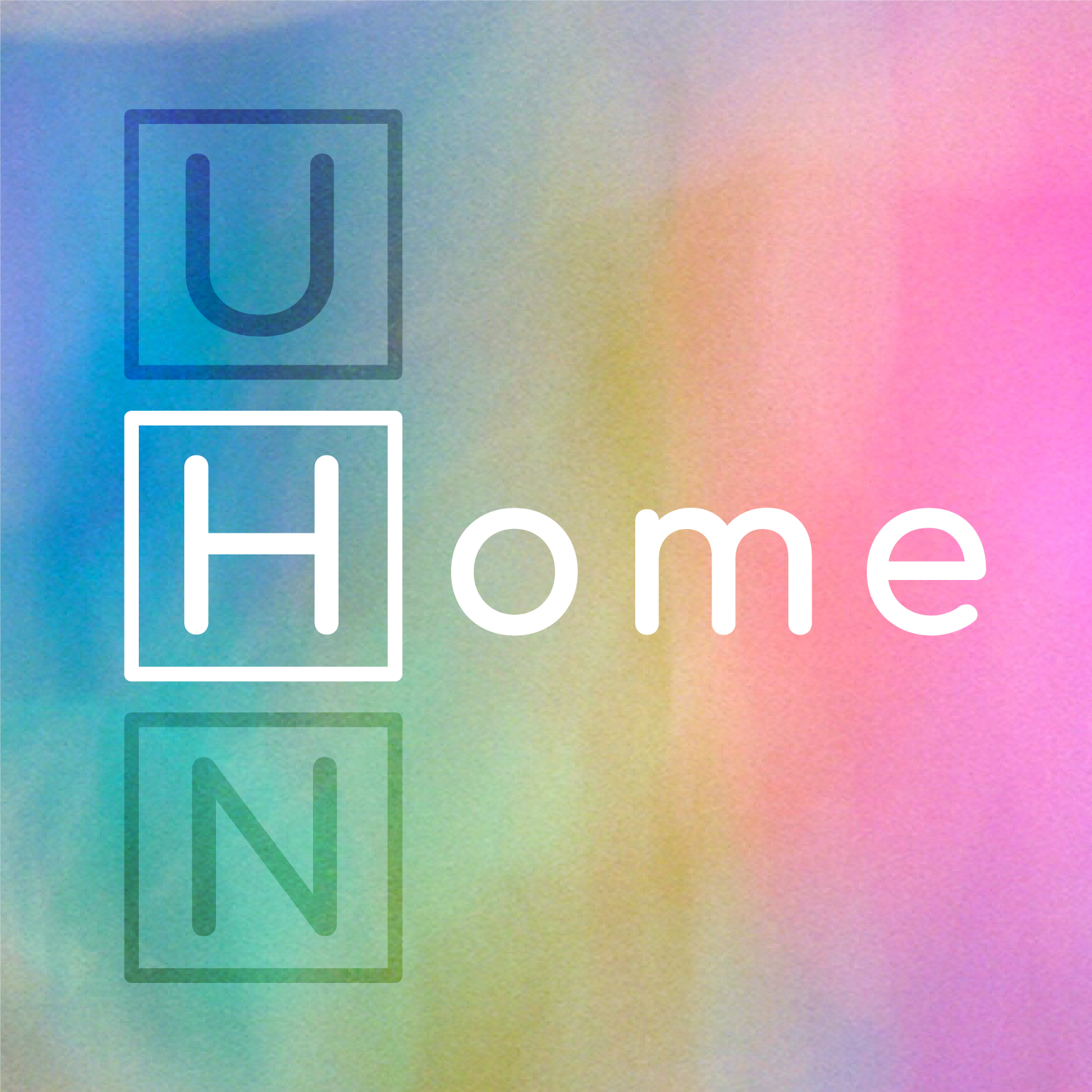
On the second round of conceptual exploration, we looked into using abstract, geometric, and colourful shapes that symbolize the spectrum of humanity. The client liked the circular helix example, as it reminded them of glass marbles and kaleidoscopes, a fitting symbol for the people of UHN and their stories.
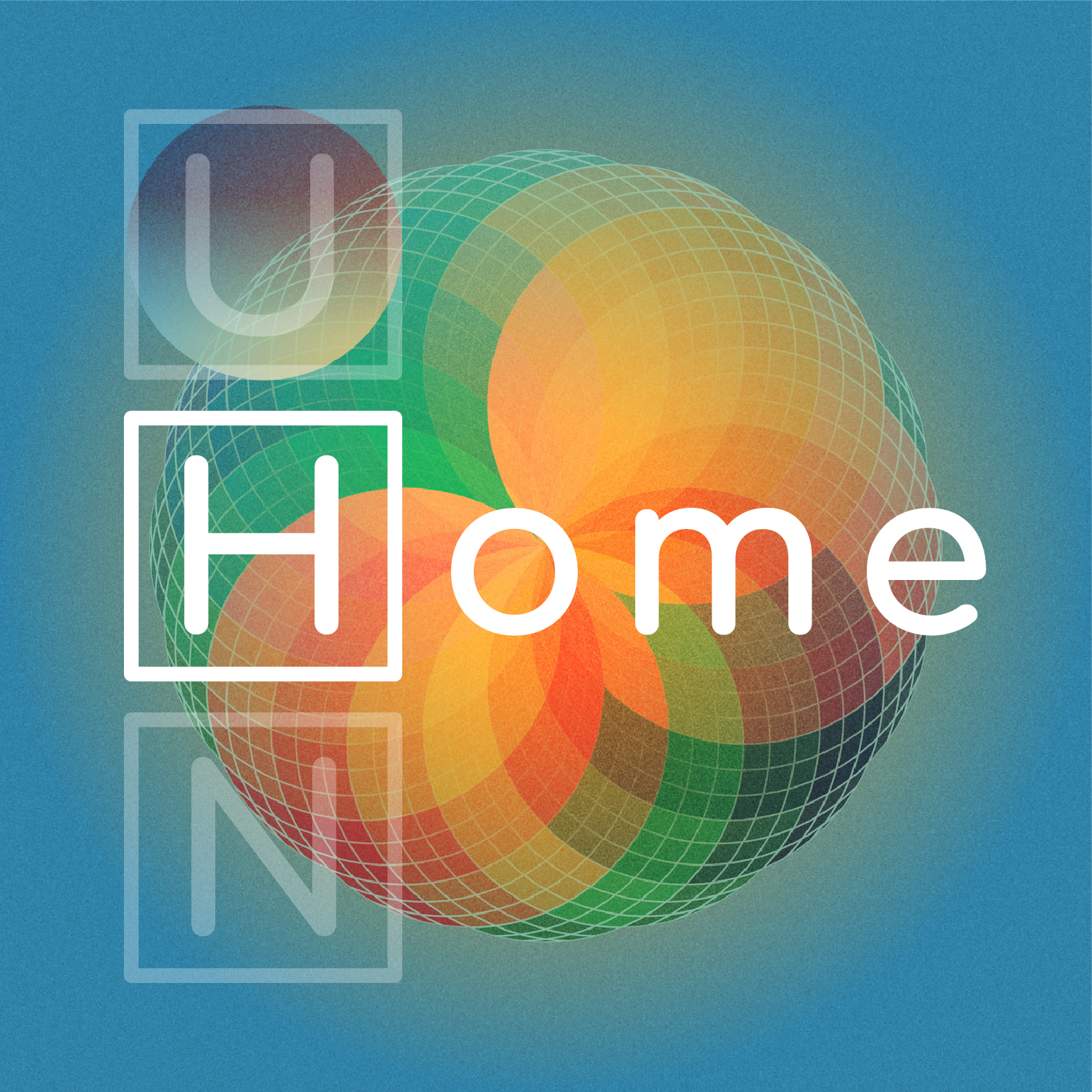





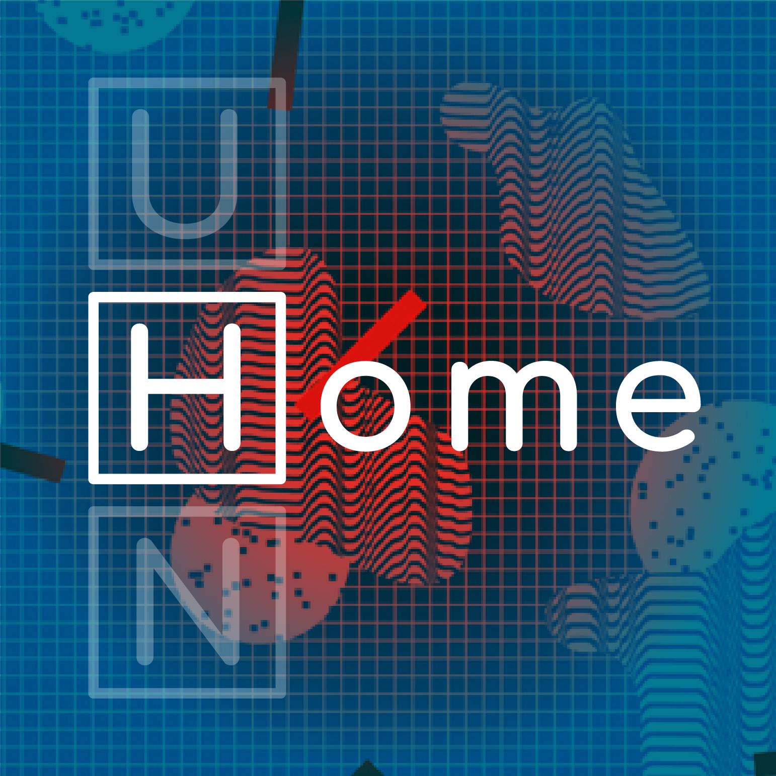
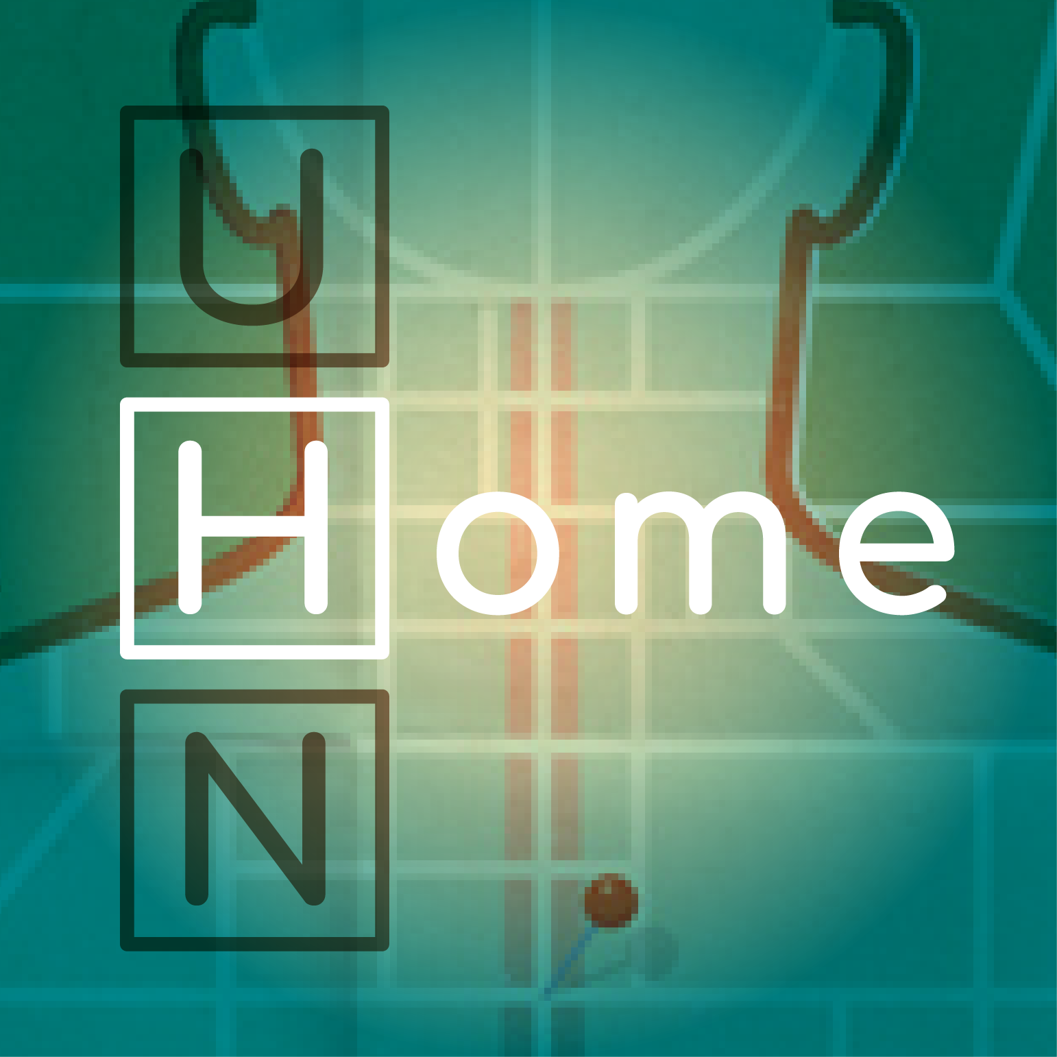
For the final iteration, I refined the circular helix marble concept to include the ‘leaves’ of UHN that symbolize care, research, and teaching, the essential elements of UHN’s corporate brand and mission. The logo encapsulates the dedication and courage of UHN’s diverse community who call Canada home.