
An underground typographic legacy
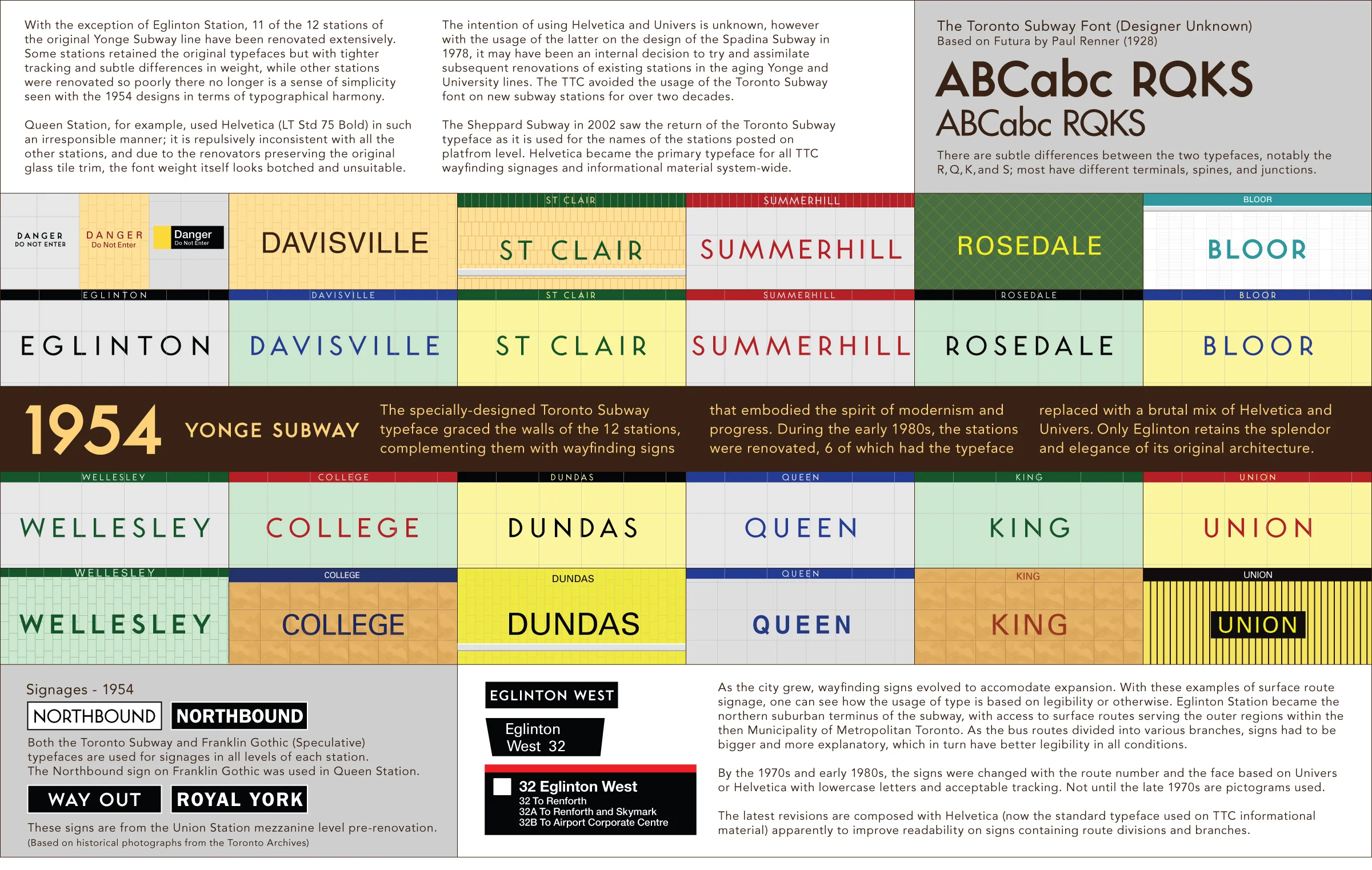
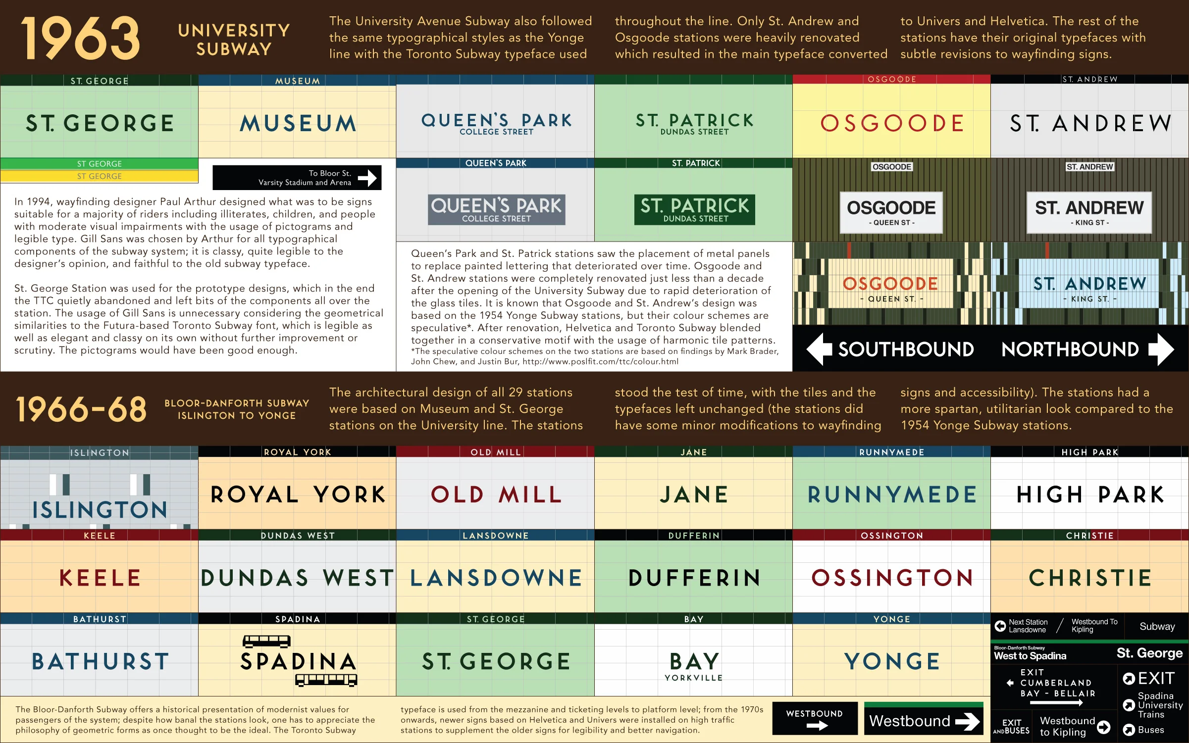
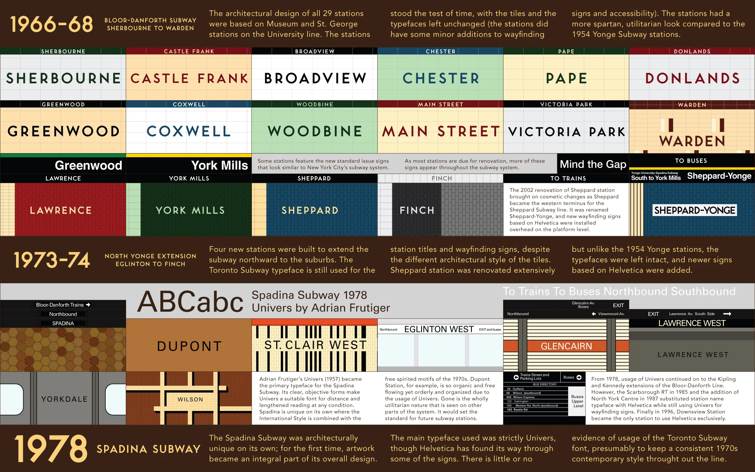
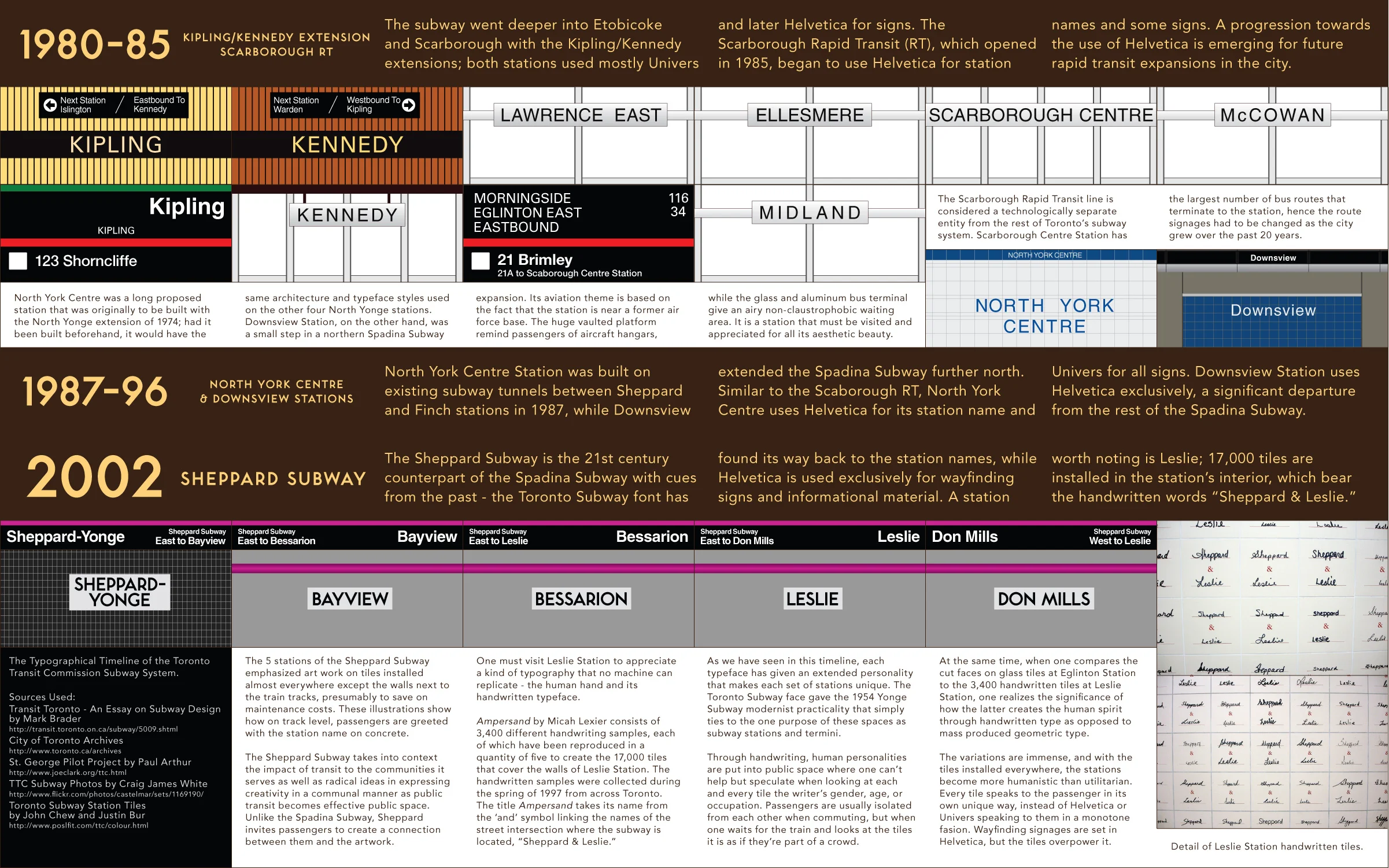
In 2005, for second year History of Typography class at OCAD University, I chose to research and create a timeline of bespoke Toronto's Subway typeface. At the time, I felt that there was a need to document a diversity of typefaces used in the current Toronto Subway infrastructure, which led to more awareness by the public as well as from the TTC in the use of the typeface in future subway infrastructure, signage and wayfinding, and promotional material.
I tried to make it as perfect and faithful as possible in terms of text kerning and tracking (spacing between letters); the Toronto Subway font was purchased from Quadrat Communications, created by graphic designer David Vereschagin. A thorough history on David’s work of digitizing and preserving the Toronto Subway font that is now entrenched in the psyche of the city’s design history and identity can be read here, here, and here.
Another great resource about the colour scheme of the stations can be found at Toronto Subway Station Tiles written by Justin Bur and John Chew. I also researched photographs from Craig White and his growing collection of TTC Subway architecture. Joe Clark, a local graphic designer, journalist, author, and accessibility expert, created an extensive research paper and provided consultancy for the TTC for wayfinding standards.
Today, the TTC uses an improved version, Bloor-Yonge, as their official identity typeface for subway station names as part of their unified signage and wayfinding program. I believe this is the end result of years of renewed enthusiasm, citizen action, and awareness for Toronto’s legacy typeface that provides meaningful visual identity found in other world-class cities.
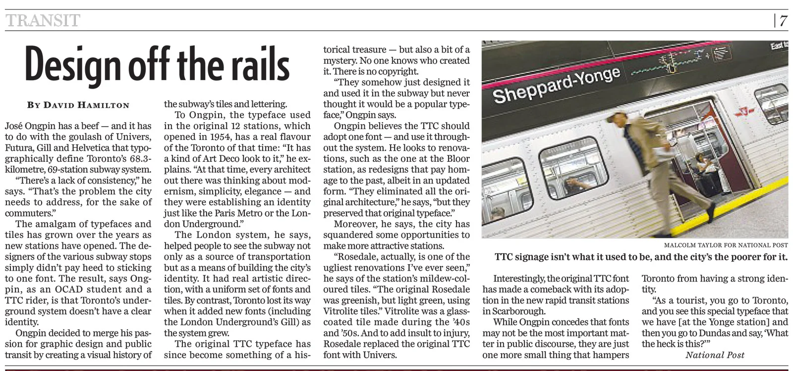
I was interviewed by the National Post in November 2011, about my beef on the “goulash of Univers, Futura, Gill, and Helvetica that typographically define Toronto’s 68.3km, 69-station (at time of writing) subway system.”